
Author: admin

  • What Is a Conversion-Focused Video Player?

    What Is a Conversion-Focused Video Player?

    You have a video, a website, and something you want visitors to do. A player described as “conversion-focused” sounds relevant, but the label leaves an important question unanswered: which part of that job does the software actually handle?

    Understanding the boundary helps you evaluate features without expecting the player to fix the offer, explain the product, or complete the visitor’s entire journey. It also helps you avoid paying attention to capabilities you have no reason to use.

    What is a conversion-focused video player?

    A conversion-focused video player is a video player designed to support a marketing task around playback. That can include shaping the player’s appearance, presenting a call to action, requesting contact information, or recording viewing and interaction signals.

    In this guide, the term describes the player’s intended role. It is not a promise that installing one will increase conversions, nor a guarantee that every product offers the same features.

    The useful distinction is between making video available to watch and equipping the viewing experience for a specific task. A product demonstration might need a link to a detailed specification. An educational recording might support an email request. An informational video might need no interaction at all.

    Where the player’s responsibility begins and ends

    Separate the work into three parts before evaluating software:

    • Video source and hosting: where the video is maintained and made available for playback.
    • Player experience: how visitors encounter playback and any supported presentation, interaction, or reporting features.
    • Destination and follow-up: what happens after a click or contact request, including the page, form, offer, and work needed to respond.

    These responsibilities can sit in different systems. A player evaluation does not automatically mean a hosting migration, and a clickable action does not mean that the destination or follow-up has been configured.

    For example, a video can offer a link to a booking page. The booking page still needs to explain the appointment, work correctly, and collect the information your team needs. The player supplies one part of that experience.

    Four capability families to understand

    Use these families to describe a requirement. Verify the exact behavior in each product you consider; a broad feature label is only a starting point.

    Presentation that fits the surrounding page

    Player appearance matters when your team needs the video experience to fit a particular brand treatment. Useful requirements might concern the play button’s style or color and the overall player skin.

    Be specific about what needs changing. “Customizable” does not tell you which elements you can edit, and a suitable color scheme does not establish that the controls are easy to use.

    A relevant action around the video

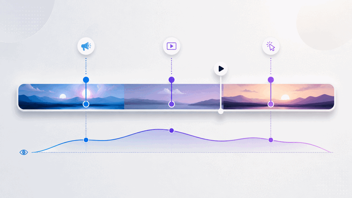
    A call to action gives a viewer a next step, such as opening a product guide or visiting a registration page. Timing can be a requirement when the request relates to something explained during the video.

    The important buying question is whether the player supports the action you need. The exact copy and moment deserve their own editorial decisions after the capability is established. Adding several actions is not inherently more useful than providing one clear option.

    Contact capture where it serves the task

    An email request or lead gate may be relevant when there is a clear reason for the viewer to share contact information. That reason should be understandable before your team starts configuring a form.

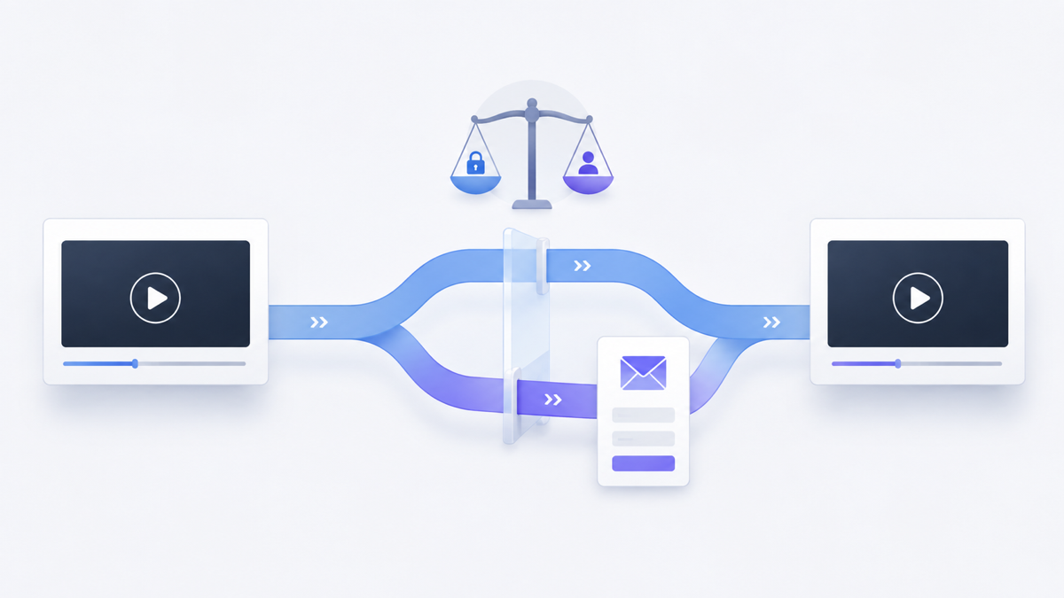
    Evaluate capture and follow-up separately. A form’s presence does not establish how submissions reach the person responsible for responding, which fields are supported, or whether another system is involved. Verify those details for the workflow you intend to use.

    Evidence about viewing and actions

    Reporting can help answer questions such as whether viewers watched the video or used an available action. Choose the question first, then identify which reported signal could answer it.

    Ask what a metric counts, which period it covers, and what context is available. A recorded click is evidence of an interaction; it does not establish that a booking, purchase, or useful conversation followed.

    What this looks like in practical use

    The following are hypothetical planning examples, not customer results.

    A demonstration with a detailed next step

    A team has a short demonstration and a separate technical specification. It needs a way for interested viewers to open that specification while the subject is relevant.

    The requirement is a clickable action with an appropriate destination, plus timing if the action should appear alongside a particular explanation. The team still owns the specification’s accuracy and whether it answers the viewer’s next question.

    An educational video connected to a resource

    A creator has a lesson and an accompanying resource. Before adding contact capture, the creator decides what a viewer receives and how the request will be handled.

    The player requirement may be an email opt-in. Resource delivery and subsequent communication need their own verified process. If that process is not ready, adding the request would introduce an unfinished step.

    A video whose job ends with understanding

    A business embeds an explanation of a routine process. There is no useful action to request inside the video; the surrounding page already contains the necessary information.

    In this case, presentation and playback may be sufficient. A conversion-focused product can still be evaluated for relevant capabilities, but there is no reason to add a gate or CTA simply because one is available.

    Turn feature claims into acceptance tests

    A useful evaluation produces observable answers. Write a short test for each essential requirement and record whether it passed, failed, or still needs investigation.

    Example acceptance tests for a marketing video-player evaluation
    Requirement What to test What remains separate
    Use an existing video Try the actual source you intend to use and confirm playback on the intended page. Source permissions, hosting arrangements, and ongoing source maintenance.
    Match the visual treatment Apply the required supported styling and inspect the resulting player. The surrounding page design and accessibility evaluation.
    Offer a contextual next step Check that the intended action appears and opens the correct destination. The destination’s content and whether the visitor completes its task.
    Request contact information Use a test submission to verify the configured request and how your team retrieves the response. Resource delivery, consent arrangements, and follow-up responsibilities.
    Answer a reporting question Perform a known test action and inspect the relevant report using its documented definition. Business outcomes or attribution that the report does not establish.

    This table is an evaluation method, not a statement that every player supports every row. Omit requirements that do not serve your use case, and investigate any essential behavior that remains unclear.

    Include implementation quality in the decision

    Test the actual experience your visitors will encounter, including relevant devices and page layouts. Previewing an attractive player alone is not enough to validate its fit.

    Accessibility deserves a specific check. W3C’s media-player accessibility guidance identifies keyboard support, visible keyboard focus, clear labels, and sufficient contrast as important player functions. Use those criteria when evaluating a candidate. They are not claims that Vidzy, or any other player discussed here, has passed an accessibility assessment.

    Also decide who maintains the configuration. A destination can change, a resource can become outdated, or a video can be replaced. Assign responsibility for checking that the experience still matches the page’s promise after those changes.

    How Vidzy fits this category

    Vidzy is an embeddable video player focused on marketing and conversion use cases. It supports YouTube and Vimeo video URLs and MP4, and allows video to remain hosted with the existing provider.

    Its capabilities include player skins, play-button style and color customization, timed clickable CTAs, timed email opt-ins, and lead gates. Vidzy also provides video analytics, including watch-time tracking, drop-off analysis, and CTA click tracking. It supports HTML embedding.

    For the demonstration example, a Vidzy workflow can combine a supported video source, a player skin, and a timed CTA pointing to the relevant specification page. CTA click tracking can provide evidence about use of that action. Your team still needs to verify the configured experience and evaluate what visitors do at the destination.

    That is a capability-level example, not a complete installation guide. It does not assume particular form fields, metric calculations, automatic follow-up, or a measured conversion improvement. Those details should never be inferred from the category label.

    Common mistakes when evaluating a player

    • Buying from the feature count: A feature matters when it addresses a requirement you can explain and test.
    • Confusing capture with follow-up: Establish who receives a request and what they do with it.
    • Treating a report as proof of impact: Check which behavior it measures and which business question remains unanswered.
    • Expecting the player to repair the message: The video’s explanation, the offer, and the destination still need to make sense.
    • Accepting vague implementation answers: Record unresolved behavior before committing to a workflow that depends on it.

    Choose one video and write down the specific capability missing from its current experience. Then define an observable test for that requirement. If presentation, timed actions, email capture, or viewing evidence is relevant, explore Vidzy’s conversion-focused video player against that test.
  • Where to Put Video on a Landing Page: A Practical Placement Guide

    Where to Put Video on a Landing Page: A Practical Placement Guide

    A landing-page video can be useful and still sit in the wrong place. Put it in the hero before visitors understand the promise, and the play button may ask for attention without giving a reason. Bury a necessary demonstration near the bottom, and people may evaluate the offer without seeing the clearest explanation.

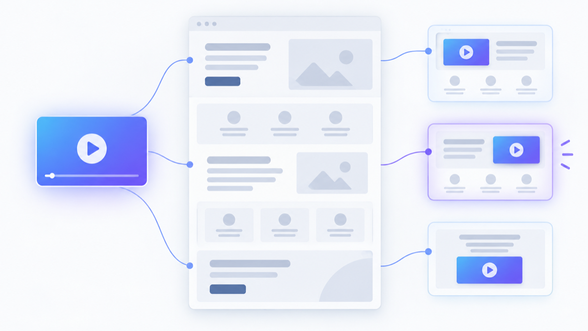
    The answer is not “always above the fold” or “always next to the CTA.” Good landing page video placement follows the page’s information sequence. The video should appear after the visitor has enough context to want it and before the decision it is meant to support.

    This guide gives you a practical way to find that point without relying on a universal layout rule or an invented conversion benchmark.

    Where should you put a video on a landing page?

    Place the video at the earliest point where three conditions are true:

    1. The visitor understands what the page offers and why the video is relevant.
    2. The video contributes something the surrounding copy or images do not communicate as clearly.
    3. A reasonable next step becomes available after the viewer receives that information.

    That point may be the hero for a concise primary explanation. It may be below the opening promise when the headline and supporting copy need to establish context first. It may sit beside a product detail, objection, or CTA when its job is to resolve a specific concern.

    Start with the video’s job, not a template.

    Define the video’s job on this page

    A landing page usually asks a visitor to make one primary decision. The video should remove a particular barrier to that decision rather than repeat the whole page in another format.

    Complete this sentence:

    After watching this video, the intended visitor should be better able to ______.

    Useful answers include:

    • Understand an unfamiliar offer
    • See how a product or process works
    • Compare two approaches
    • Believe that the solution fits a specific situation
    • Resolve a material objection
    • Prepare to take the page’s primary action

    “Feel engaged” is not specific enough. A clear job tells you what must appear before the video, where the player belongs, and which action should follow.

    Use this landing page video placement matrix

    Landing-page video positions and the jobs they can support
    Possible position Strongest reason to use it What should already be clear Main risk to check
    Hero or opening section The video is the fastest useful explanation of the core offer The headline gives viewers a concrete reason to press play The player overwhelms the promise or pushes the primary action out of view
    After the core promise Brief copy creates context before the video adds depth The visitor knows the problem, audience, and expected value The video merely repeats the opening instead of advancing understanding
    Beside a feature or process A demonstration makes a specific mechanism easier to understand The visitor knows why that mechanism matters The section becomes crowded or confusing on smaller screens
    Near proof or an objection The video supplies context that helps evaluate fit or credibility The concern being addressed is explicit The video asks viewers to infer what claim it is meant to support
    Near the primary CTA The video resolves the final question before action The offer and commitment are already understandable The video competes with the CTA or reopens questions the page had settled
    Lower-page deep dive Interested visitors need optional detail without slowing the main argument The page remains persuasive and usable without watching The video is essential but appears too late to influence evaluation

    The matrix does not rank the positions. It connects each location to a job and a failure mode.

    Use hero placement when video carries the opening explanation

    A hero video is appropriate when seeing or hearing the explanation is central to understanding the offer. A short product overview, a concise demonstration, or a clear statement from a trusted expert may earn that prominence.

    The surrounding section still needs to work before anyone presses play. Give the visitor a specific headline, a short explanation, and a visible primary action when that action is appropriate. The thumbnail or poster should signal what the viewer will learn rather than act as decoration.

    Review the layout without playing the video. If the offer becomes vague, the video may be carrying information that should also appear in the page copy. If the player dominates every other element, reduce its visual weight or move it after the opening promise.

    Let the core promise come first when context creates interest

    Some visitors need to recognize the problem or understand the result before a video feels worth their time. In that case, place the opening message first and use the video as the next layer of explanation.

    This works well when the video:

    • Shows how the promised outcome is achieved
    • Demonstrates a workflow introduced by the opening copy
    • Explains a concept that would make the hero too dense
    • Answers the first substantial question raised by the promise

    Do not add a generic heading such as “Watch our video.” Introduce the actual value: what question will the video answer, and why is that answer relevant now?

    Place demonstrations beside the claim they explain

    A demonstration is easiest to evaluate when it appears close to the feature, process, or outcome it clarifies. Distance creates interpretation work. The visitor has to remember a claim from earlier or guess which part of the page the video supports.

    Keep the section focused. Pair the video with a concise explanation rather than a second full pitch. On a narrow screen, decide whether the explanation or the player should come first. Preserve that order deliberately instead of accepting whatever stacking order the desktop layout produces.

    If several page sections each appear to need a video, question whether every clip is necessary. Multiple players can fragment attention and create additional loading work. One strong demonstration with clear surrounding context may serve the page better than several overlapping clips.

    Connect placement with the page’s next action

    Video placement and CTA design are related, but they are not the same decision. Placement determines when the visitor encounters the explanation. The CTA determines what the visitor can do after it becomes useful.

    Ask:

    1. What should a viewer understand before seeing the action?
    2. Does the action remain visible or easy to find after playback?
    3. Does its wording continue the video’s promise?
    4. Can a visitor who does not watch still understand the action?

    A CTA can appear around the player or, when the player supports it, within the viewing experience. Avoid presenting several equally prominent choices at once. The video should reduce uncertainty before the next step, not create a new navigation menu.

    Make the page useful without requiring playback

    Some visitors will not press play. They may be scanning, returning to confirm one detail, browsing in a setting where audio is inconvenient, or using an interaction method that makes the experience different from the one you designed.

    Keep the essential offer, major conditions, and primary action available in the page itself. Use video to explain, demonstrate, or add context. Do not hide information a visitor must know solely inside an optional recording.

    For prerecorded synchronized media with audio, accessibility requirements also matter. W3C’s explanation of WCAG Success Criterion 1.2.2 says captions are provided for prerecorded audio content in synchronized media, except when the media is clearly identified as an alternative that presents no more information than existing text. Review the exact scope in the official W3C guidance on prerecorded captions.

    Caption availability and other media-accessibility needs depend on the video, player, implementation, and applicable requirements. Verify them before launch rather than assuming the embed handles them automatically.

    Check the mobile sequence separately

    Desktop proximity does not guarantee a clear mobile experience. Two side-by-side elements may become a long vertical sequence. A video placed “next to” an objection can end up several screens away from it after headings, copy, and controls stack.

    On a real narrow viewport, check:

    • Whether the headline and video still appear in a sensible order
    • Whether the player has a stable, usable size
    • Whether the primary CTA remains easy to find after playback
    • Whether surrounding copy is separated clearly from player controls
    • Whether the page remains understandable without playing the video

    Treat mobile ordering as editorial structure, not a final cosmetic adjustment.

    Match loading behavior to the placement

    An offscreen video does not necessarily need to load with the opening section. web.dev documents that lazy-loading an offscreen iframe can defer its loading until the visitor scrolls near it, reducing initial resource use. See the implementation context in its guide to lazy-loading offscreen iframes.

    That does not mean every video should be lazy-loaded. A primary video in the opening viewport, a poster that contributes to the page’s initial rendering, and an offscreen supporting embed have different loading considerations. Test the actual page and implementation rather than applying one attribute mechanically.

    Reserve stable space for the player so the surrounding layout does not jump when it appears. Check the page on a slower connection and on the devices that matter to your audience. Placement is only successful if the intended visitor can encounter and use the video without the page becoming harder to navigate.

    Measure placement as part of the whole page

    A placement test should begin with a decision. For example: “Should the demonstration appear immediately after the promise or beside the feature explanation?” Define what you expect each position to change before moving the player.

    Review evidence in layers:

    • Opportunity: Did visitors reach the section and have a reasonable chance to notice the player?
    • Viewing: Did playback and attention behavior change?
    • Action: Did use of the relevant CTA change?
    • Outcome: Did the wider page journey produce its intended result?

    A change in one layer does not prove the cause. Moving a video also changes the visual hierarchy, nearby copy, scroll position, and relationship with the CTA. Record those differences, keep the page version and traffic context clear, and avoid changing several major elements when you need to learn from one placement decision.

    How Vidzy can support the planned experience

    Vidzy is an embeddable, conversion-focused video player with player skins and play-button style and color customization. Those approved controls can help the player feel intentional within the page design without determining where it belongs.

    Vidzy also supports timed, clickable calls to action that can send viewers to a chosen destination. Its approved analytics capabilities include watch-time tracking, drop-off analysis, CTA click tracking, and replay tracking. These signals can support a placement review, but they do not diagnose why a visitor acted or prove that placement caused a business outcome.

    Choose the location and page sequence first. Then evaluate whether the player customization, action, and measurement capabilities fit the experience you planned.

    Landing page video placement checklist

    1. State the page’s primary visitor decision.
    2. Give the video one page-level job.
    3. Write what the visitor must understand before pressing play.
    4. Write what becomes reasonable immediately after watching.
    5. Choose the earliest position where both statements make sense.
    6. Confirm the page still communicates its essential offer without playback.
    7. Check captions and other applicable media-accessibility needs.
    8. Review the stacking order and CTA visibility on a narrow viewport.
    9. Test the actual embed’s loading and layout behavior.
    10. Define opportunity, viewing, action, and outcome evidence before launch.

    Landing page video placement FAQs

    Should a landing-page video always be above the fold?

    No. Above-the-fold placement is useful when video is central to the opening explanation and the surrounding section provides enough context to justify playback. If copy must establish the problem or promise first, a lower position may create a clearer sequence.

    Should the CTA be inside the video or on the page?

    Use the location that makes the next step clear and accessible in the intended journey. A page CTA remains available to people who do not play the video. An in-video CTA can connect an action to a relevant moment. Some pages may use both, but they should represent a coherent primary action rather than competing choices.

    How many videos should a landing page include?

    There is no universal number. Add a video only when it performs a distinct job that the page needs. If multiple clips repeat the same explanation or divide attention between several paths, consolidate them or keep the strongest one.

    Open the landing page and complete two sentences: “Before this video, the visitor needs to understand…” and “After this video, the visitor should be ready to…” Place the player where those statements meet, then review Vidzy’s approved player capabilities if you need a more intentional embedded experience.

  • Creating an Effective Video Marketing Funnel

    Creating an Effective Video Marketing Funnel

    A collection of marketing videos is not automatically a video funnel. The funnel begins when each video serves a defined audience need and leads to a deliberate next decision.

    Without that structure, every video tends to do too much. An introductory video tries to explain the product, answer objections, collect an email, and close the sale. Its call to action points wherever the team needs traffic that week. The dashboard reports activity, but nobody can say which part of the journey the video was meant to improve.

    A practical video marketing funnel fixes the planning problem first. Instead of starting with a list of videos to produce, start with the decisions a potential customer must make. Then give each video one job, one next step, and one evidence plan.

    What is a video marketing funnel?

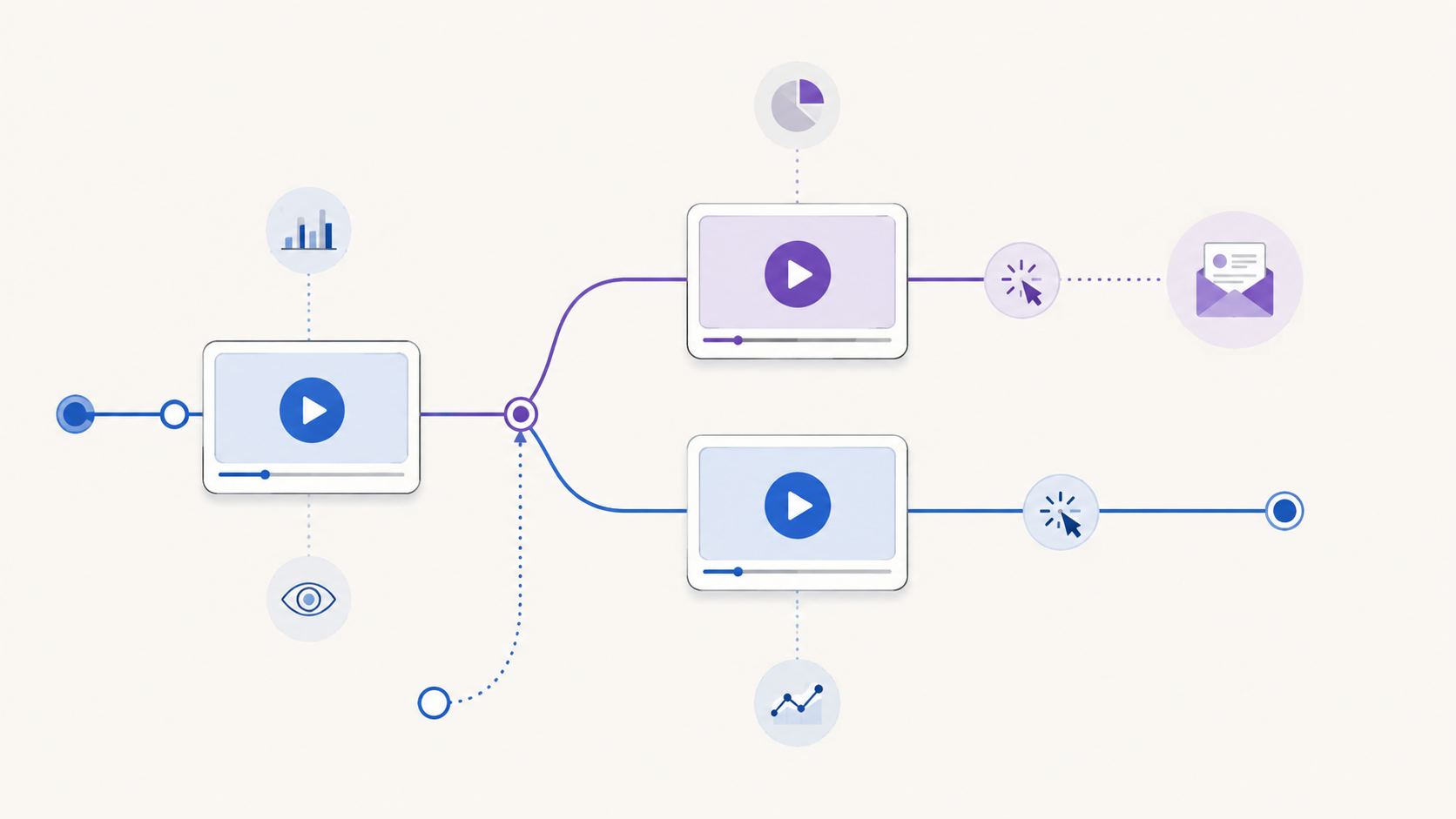
    A video marketing funnel is a connected journey in which videos help people move from one level of understanding or intent to another. A video can introduce a problem, explain an approach, demonstrate a solution, address a concern, or help a ready buyer take action. Its place in the funnel depends on the decision it supports, not simply its format or length.

    The word “funnel” can suggest that every person enters at the top and follows the same narrow path. Real journeys are less orderly. Someone may first encounter a detailed product demonstration because a colleague shared it. Another person may watch an educational video, leave, and return later through a different page.

    That is why the useful unit of planning is not a rigid stage label. It is a four-part connection:

    1. Audience state: What does this viewer understand, need, or question now?
    2. Video job: What useful change should the video make in that state?
    3. Next step: What is the most proportionate action after that change?
    4. Evidence: What behavior would help you evaluate whether the connection worked?

    If you cannot describe all four parts, the video may still be useful, but its role in the funnel is not yet clear.

    Build backward from the final decision

    Begin with the final decision your journey is designed to support. It might be starting a trial, requesting a consultation, choosing a plan, registering for an event, or making a purchase. Name the real decision rather than using a vague goal such as “drive engagement.”

    Then work backward:

    1. What must a person understand or trust immediately before making that decision?
    2. What questions would prevent that understanding?
    3. What earlier problem or opportunity would make those questions relevant?
    4. Where can video explain, demonstrate, or reassure more effectively than surrounding copy alone?

    This exercise prevents the common mistake of producing videos first and inventing a funnel around them afterward. It may also show that some steps do not need video. A short comparison table, calculator, product page, or direct conversation may be the better tool.

    Map stages to reader needs, not content clichés

    Awareness, consideration, and decision are useful labels, but they should describe changes in the viewer’s situation. Do not assume that a particular format always belongs to a particular stage.

    A decision-led map for a video marketing funnel
    Journey stage Viewer’s immediate need Possible video job Proportionate next step Evidence to review
    Problem recognition Understand a problem and decide whether it matters Clarify the cost, mechanism, or missed opportunity Explore a deeper guide or relevant example Playback starts, viewing patterns, and movement to the next resource
    Approach evaluation Compare possible ways to solve the problem Explain criteria, tradeoffs, and suitable contexts Review an implementation guide, demonstration, or comparison Attention around key criteria and use of the offered next step
    Solution evaluation See whether a specific solution fits Demonstrate the relevant workflow or answer a material objection Inspect the product, request more detail, or begin evaluation Viewing of decisive sections and measurable action around the video
    Decision Confirm fit and understand the immediate commitment Resolve the remaining question without reopening the whole pitch Take the defined commercial or operational action Completed next steps and downstream outcomes from the wider journey

    The examples are prompts, not universal rules. A demonstration can create initial awareness when the audience already knows the problem. An educational walkthrough can support a late-stage decision when the final concern is technical understanding. Place the video according to the viewer’s question.

    Give each video one primary job

    A video may produce several useful effects, but it needs one primary job for planning and evaluation. Choose a verb that describes the intended change:

    • Recognize a costly problem
    • Understand a method
    • Compare two approaches
    • See a workflow in context
    • Resolve a specific objection
    • Prepare for a sales or onboarding conversation

    “Engage the audience” is too broad. “Help a landing-page marketer understand why player choice affects the on-page viewing experience” is specific enough to shape the script, placement, CTA, and evidence plan.

    One primary job also makes editing easier. If a section does not help produce the intended change, move it to another asset or remove it. That discipline usually creates a clearer path than asking one long video to serve every stage.

    Choose the next step after the video earns it

    The next step should match the amount of clarity and intent the video has created. An early educational video may reasonably offer another guide. A detailed evaluation video may support a product review or conversation. A request for contact information makes sense only when the viewer can understand the value of the exchange.

    For each video, write the CTA as a continuation of the viewer’s task:

    • “See the full comparison” continues an evaluation.
    • “Watch the setup walkthrough” continues implementation research.
    • “Get the worksheet” continues a planning exercise.
    • “Review the product” continues solution evaluation.

    Avoid making every next step a sale. If the video has only established the problem, an immediate high-commitment request may skip the questions the viewer still needs answered.

    Design branches instead of forcing one sequence

    Your funnel should accommodate people who enter with different levels of knowledge. A first-time visitor may need context. A referral may already understand the category and want proof of fit. A returning prospect may need only one answer.

    Map at least three paths:

    1. Primary path: the most common sequence you expect.
    2. Fast path: a route for viewers who already have enough context.
    3. Recovery path: a useful alternative for someone who is not ready for the primary CTA.

    This is not an argument for filling every video with buttons. Too many competing actions weaken the decision. Keep one primary action, then use the surrounding page or follow-up experience for reasonable alternatives.

    Measurement tools also distinguish between open and closed funnel models. Google Analytics, for example, documents that its Funnel exploration can represent steps in a user journey and can be configured so people either enter at any step or must enter at the first step. Those are GA4-specific reporting definitions, but the distinction is a useful planning reminder: decide whether your journey genuinely requires a fixed entry point before evaluating its results. See the official GA4 Funnel exploration documentation for its precise behavior.

    Define the evidence before launch

    Do not wait for a dashboard to decide what success means. Write the evidence plan beside the funnel map before publishing each step.

    Use four layers:

    1. Opportunity: Did the intended audience encounter the page and have a reasonable chance to play the video?
    2. Attention: Did viewing behavior suggest that people reached the section required for the video’s job?
    3. Action: Did viewers use the defined CTA, opt-in, or other measurable next step?
    4. Outcome: Did the wider journey produce the business or operational result you actually care about?

    These layers should not be collapsed into one verdict. Watch time does not prove understanding. A click does not prove that the destination delivered. A completed outcome does not, by itself, prove that the video caused it.

    Record metric definitions, date ranges, traffic context, video versions, and known gaps before comparing results. If the system cannot measure a transition reliably, name that limitation instead of filling it with an assumed rate.

    How Vidzy can support an embedded-video step

    Vidzy is an embeddable, conversion-focused video player. It supports timed, clickable calls to action that can send viewers to a chosen destination. It also supports timed email opt-ins and lead gates when lead capture is an appropriate part of the journey.

    For evaluation, Vidzy provides video analytics, including watch-time tracking, drop-off analysis, CTA click tracking, opt-in tracking, and replay tracking. These capabilities can supply evidence around an embedded-video step, but they do not design the funnel, diagnose viewer motivation, or prove that the video caused a downstream outcome.

    Start with the journey map. Then evaluate which player capabilities are required at each embedded-video step. The tool should implement a deliberate path, not substitute for one.

    Common video-funnel mistakes

    • Starting with formats: “We need a webinar and three short videos” is a production list, not a journey.
    • Giving every video the same CTA: One destination rarely matches every level of viewer intent.
    • Making each step a sales pitch: Early-stage viewers often need clarity before commitment.
    • Assuming a linear path: Referrals, returning visitors, and experienced buyers may enter later.
    • Measuring attention as an outcome: Viewing evidence and business results answer different questions.
    • Changing the whole funnel at once: Multiple simultaneous changes make the useful lesson harder to identify.
    • Ignoring the destination: A clear video CTA cannot repair a page that breaks the promise or adds unnecessary friction.

    Use this video-funnel mapping worksheet

    Run this exercise with one customer journey before planning new production:

    1. Write the final decision in one sentence.
    2. List the questions a person must resolve immediately before that decision.
    3. Work backward until you reach the earliest problem or opportunity.
    4. Mark the places where video is the clearest medium.
    5. Give each selected video one audience state and one primary job.
    6. Choose one proportionate next step for each video.
    7. Add a fast path and a recovery path where they are genuinely useful.
    8. Define opportunity, attention, action, and outcome evidence.
    9. Confirm what your tools actually measure before setting expectations.
    10. Publish the smallest coherent path, observe it, and revise one meaningful connection at a time.

    The result should fit on one page. If the map requires a complicated diagram to explain who should watch what next, simplify the journey before producing more videos.

    Video marketing funnel FAQs

    How many videos should a video marketing funnel have?

    There is no required number. Use enough videos to answer the material questions in the journey where video is genuinely the right medium. A short path with two focused videos can be more coherent than a large library with unclear transitions.

    Can one video serve more than one funnel stage?

    Yes, especially when audiences enter with different levels of knowledge. Give the video one primary job, then check whether its placement, introduction, and next step still make sense in each context. Do not assume the same CTA suits every placement.

    What should you measure in a video funnel?

    Measure the opportunity to view, attention around the video’s intended job, use of the defined next action, and the wider journey’s outcome. Keep those layers separate and document how each measure is calculated before interpreting changes.

    Map one journey before adding another video. Once the audience state, video job, next step, and evidence are clear, review Vidzy’s approved player capabilities and decide whether they fit the embedded steps you designed.

  • Video CTA Timing: How to Choose the Right Moment

    Video CTA Timing: How to Choose the Right Moment

    A video call to action can be clear, relevant, and persuasive yet still underperform because it appears at the wrong moment. Show it before the viewer understands the value and the request feels premature. Wait until the final frame and interested viewers may never see it.

    There is no universal timestamp that solves this problem. The right video CTA timing depends on what you are asking, what the viewer already knows, and when the video earns enough trust to make the next step feel reasonable.

    This guide gives you a practical way to choose that moment without relying on invented benchmarks or guesswork.

    What is the best time to show a video CTA?

    The best time to show a video CTA is the earliest point at which an interested viewer has enough context to understand the offer and enough motivation to take the next step. That point may be near the beginning for a familiar offer, midway through a demonstration after the key benefit becomes clear, or at the end when the full argument matters.

    Use these four questions to find it:

    1. What exact action should the viewer take?
    2. What must the viewer know or believe before that action makes sense?
    3. At what moment does the video provide that context?
    4. What does viewer behavior show after the CTA goes live?

    This turns CTA placement into an editorial decision you can test and refine, rather than a rule based only on video length.

    Start with the action, not the timestamp

    Before choosing when a CTA should appear, define what it should accomplish. “Get more conversions” is too broad. Name one observable next step:

    • View a product page
    • Book a consultation
    • Start a trial
    • Download a resource
    • Register for an event
    • Join an email list

    The size of the request affects its timing. A low-commitment action such as viewing a related resource may need little preparation. A higher-commitment action such as booking a call usually needs more context: who the offer is for, which problem it addresses, and what happens after the click.

    Write the intended action at the top of your video outline. If you cannot express it in one sentence, the CTA is not ready to time.

    Identify the minimum context the viewer needs

    A CTA becomes timely when the viewer has the information needed to evaluate it. That does not always mean watching the entire video. It means reaching the point where the request follows logically from the content.

    For a product demo, that point might come just after the viewer sees the core workflow. For an educational video, it might follow the first useful lesson, when a related template or deeper guide becomes relevant. For a sales video, the CTA may need to wait until the problem, proposed solution, and important objections have been addressed.

    List the minimum context required before the ask:

    • The problem is recognizable.
    • The promised next step is relevant to that problem.
    • The viewer knows what will happen after clicking.
    • The request is proportionate to the value delivered so far.

    The CTA should generally appear after these conditions are met, not after an arbitrary percentage of the runtime.

    Map the moments that matter in the video

    Review the video as a sequence of decisions rather than one continuous block. Mark the moments where the viewer learns something important, sees evidence, understands the mechanism, or receives a complete answer.

    How key video moments can inform CTA timing decisions
    Video moment What changes for the viewer CTA implication
    Problem recognition The viewer recognizes that the subject applies to them. A light next step may be relevant, but a large request can still feel early.
    First useful insight The video has delivered value and established relevance. A resource or low-commitment action may fit here.
    Mechanism or demonstration The viewer understands how the proposed solution works. A product-focused CTA may now have sufficient context.
    Objection resolved A likely reason for hesitation has been addressed. A higher-commitment CTA may become more reasonable.
    Summary or conclusion The complete argument or lesson is clear. A direct next step can close the loop.

    This map gives you candidate CTA moments. Choose the earliest candidate that supports the specific action you defined.

    When early, middle, and end CTAs make sense

    Use an early CTA when intent is already high

    An early CTA can work when viewers arrive with clear intent and the offer needs little explanation. Someone watching a short feature walkthrough from a product page may already know the product and simply need a route to the relevant next step.

    Keep an early CTA proportional to the context available. “See the full example” makes a smaller leap than “Book a strategy call” in the opening seconds.

    Use a mid-video CTA after a meaningful payoff

    A middle placement is useful when the video delivers an important insight or demonstration before its conclusion. The CTA can appear immediately after that payoff, while the next step is relevant to what the viewer just learned.

    Avoid interrupting a sentence, demonstration, or unresolved idea. A natural transition is usually a better trigger than the mathematical midpoint.

    Use an end CTA when the complete argument matters

    An end CTA fits stories, tutorials, and sales messages that depend on a sequence. The viewer receives the full explanation before being asked to act.

    The tradeoff is reach: some viewers will leave before the conclusion. That does not automatically make the placement wrong. If the people who remain are the only viewers with enough context for the offer, the end may still be the most coherent moment.

    Match the CTA type to the commitment level

    Not every prompt inside a video serves the same purpose. A clickable CTA sends the viewer to another destination. A lead gate or email opt-in asks the viewer to exchange information for access, continuity, or an additional resource. These actions create different levels of friction and should not be timed as if they were interchangeable.

    Use a clickable CTA when the natural next step exists elsewhere, such as a product page, booking page, or related guide. Use a lead-capture request when the exchange is explicit and the value of continuing is clear. In either case, the viewer should understand what they receive and what happens next.

    If you present more than one action, give each a distinct role. Repeating the same high-commitment request at every transition can weaken the experience instead of strengthening it.

    Write CTA copy that explains the destination

    Timing cannot rescue an unclear CTA. Labels such as “Click here” or “Learn more” make the viewer infer both the destination and the benefit. Prefer specific language:

    • See the complete workflow
    • Download the campaign checklist
    • Compare the available options
    • Book a product walkthrough

    This is also an accessibility consideration. The W3C’s WCAG 2.2 guidance says a link’s purpose should be understandable from its text alone or from its programmatically determined context. Its guidance for interactive components also calls for names and roles that assistive technology can determine. Review W3C guidance on link purpose and W3C guidance on component names and roles when implementing the interaction.

    As an editorial check, read the CTA label without the surrounding video. If the next step is still understandable, the copy is doing useful work.

    Measure and revise CTA timing responsibly

    Your first placement is a hypothesis. Viewer behavior can help you decide whether to keep it or move it.

    Start with three questions:

    1. Do viewers reach the CTA? Compare its timestamp with watch-time and drop-off patterns.
    2. Do CTA clicks occur? CTA click data shows whether the prompt generates recorded clicks. Interpret it alongside how many viewers appear to reach that part of the video, without treating the comparison as a precise view-to-click rate unless your measurement setup supports it.
    3. Does the destination complete the journey? Evaluate the result on the destination page with the appropriate measurement system rather than treating a click as the final outcome.

    Interpret the sequence carefully. If few viewers reach the CTA, moving it earlier is one possible response, but it is not the only one. The opening may be attracting the wrong audience, the video may take too long to deliver value, or the CTA may depend on information that arrives late. Editing the video can be more useful than moving the button.

    If viewers reach the CTA but rarely click, inspect the offer, label, visual prominence, and surrounding message before blaming timing. If clicks occur but the destination does not produce the intended next step, review the match between the CTA promise and the landing page.

    Change one major element at a time when practical. A simultaneous change to the video, CTA copy, destination, design, and timing may improve results, but it will not tell you which change mattered.

    Common video CTA timing mistakes

    Choosing a percentage instead of a persuasion moment

    Placing every CTA halfway through every video is consistent, but consistency is not the same as relevance. The meaningful payoff could happen much earlier or later.

    Waiting for the end by default

    The conclusion is a logical location, not a mandatory one. If the viewer receives enough context earlier, an earlier opportunity to act may be useful.

    Asking before delivering value

    A prompt that appears before the viewer understands the subject can feel like a toll. Earn the request with relevance, useful information, or a clear preview of what comes next.

    Treating every drop-off as a timing problem

    Drop-off can identify where attention changes, but it does not explain why. Review the content around that moment before drawing a conclusion.

    Optimizing for clicks alone

    A compelling label can earn clicks that the destination cannot satisfy. Judge the CTA as one part of a complete path, from the video’s promise to the page after the click.

    A practical video CTA timing worksheet

    Use this short worksheet before configuring a CTA:

    1. Primary viewer: Who is this video for?
    2. Single next step: What should that viewer do?
    3. Commitment level: Is the request low, medium, or high commitment?
    4. Required context: What must the viewer understand first?
    5. Context-complete timestamp: When has the video supplied it?
    6. Natural transition: Where can the CTA appear without interrupting an idea?
    7. CTA label: Does the text explain the destination or outcome?
    8. Reach check: What do watch-time and drop-off patterns show around that moment?
    9. Action check: What do CTA clicks show among viewers who reach it?
    10. Next revision: Which single major variable will you change if needed?

    Document the reason for the original timestamp. That note prevents future decisions from becoming a cycle of unexplained adjustments.

    How Vidzy supports a CTA-timing workflow

    Vidzy is an embeddable, conversion-focused video player with timed calls to action and clickable CTA links. Its video analytics include watch time and drop-off data, and it can track CTA clicks. Vidzy also supports timed email opt-ins and lead gates when lead capture is the appropriate next step.

    Those capabilities provide the placement and observation tools for this workflow. They do not replace the editorial decision. You still need to define the right action, identify when the video earns it, and evaluate the complete journey after the click.

    Frequently asked questions about video CTA timing

    Should a video CTA appear at the beginning or the end?

    It depends on how much context the action requires. Use an early CTA when intent is already high and the next step is easy to understand. Use an end CTA when the viewer needs the complete lesson, story, or argument before acting.

    Can a CTA appear in the middle of a video?

    Yes. A mid-video CTA can fit immediately after a useful insight, demonstration, or resolved objection. Choose a natural transition instead of interrupting an unfinished idea.

    Should I move a CTA earlier when viewers drop off before it?

    Consider it, but first inspect why viewers may be leaving. The content may delay its main value, attract the wrong audience, or lose clarity. Moving the CTA earlier helps only if viewers have enough context to respond to it.

    How do I know whether CTA timing is working?

    Review whether viewers reach the timestamp, whether those viewers click, and whether the destination fulfills the promised next step. Watch time, drop-off patterns, and CTA clicks answer different parts of that sequence.

    Choose the moment the message earns

    Effective video CTA timing is not about finding a magic percentage. It is about matching the request to the viewer’s readiness. Define one next step, identify the context it requires, place the CTA after the video provides that context, and use behavioral data to refine the decision.

    That approach gives the CTA a job, the timestamp a reason, and your next revision a useful starting point.

  • Gated Video: When to Ask Viewers for an Email

    Gated Video: When to Ask Viewers for an Email

    A gated video asks a viewer to complete an action—often entering an email address—before they can start or continue watching. That creates a clear exchange: the viewer gives you information, and you provide access to content they expect to be worth the interruption.

    The form is the easy part. The harder decision is whether the video earns the right to ask.

    Gate too early or without a clear promise, and interested viewers may leave before they understand the value. Leave every video open, and you may miss a useful opportunity to identify people who want a deeper resource. The right choice depends on the video’s job, the audience’s existing intent, and what happens after someone submits.

    What is gated video?

    Gated video is video content whose access is connected to a viewer action. In a marketing context, that action is commonly an email submission. The request may appear before playback, after a preview, or at another point in the viewing experience.

    A gate is different from a normal video call to action. A CTA offers a next step, such as visiting a page, while the viewer can continue watching. A gate makes access to some or all of the video conditional on the requested action. That difference changes the viewer’s decision and deserves its own strategy.

    Should you gate the video or leave it open?

    Gate a video when the content offers specific value that the intended viewer can understand before submitting, the email request is proportionate to that value, and your team has a useful follow-up plan. Leave it open when reach, trust, education, or easy product understanding matters more than identifying each viewer.

    Signals that favor an open or gated video experience

    Decision signal Open access is more suitable A gate may be suitable
    Primary goal Reach, education, product understanding, or easy sharing Access to a focused resource and an intentional follow-up
    Viewer context The audience is early in its research or unfamiliar with your value The audience already understands the problem and wants deeper help
    Content value The video explains information readily available elsewhere The video provides a distinctive workshop, training session, demonstration, or resource
    Follow-up No relevant email journey or next resource is ready The viewer can receive a clear, relevant continuation
    Cost of friction Losing anonymous viewers would undermine the video’s main purpose The value of identifying interested viewers justifies a deliberate access step

    This is not a scoring formula. A webinar replay may be a strong gated asset for one campaign and an open educational resource for another. Start with the job the video performs in that particular journey.

    Use four tests before adding an email gate

    1. Can the viewer understand the promise?

    Before asking for information, explain what the viewer will get. A title such as “Product Workshop” is vague. A more useful promise identifies the audience, the problem, and the expected takeaway without exaggerating the result.

    The surrounding page should answer practical questions: What does the video cover? Who is it for? How long or detailed is the experience? What becomes available after submission? If the viewer cannot assess the offer, the form asks for trust before giving them enough evidence.

    2. Is the value distinctive enough?

    Basic definitions and short awareness videos are usually easier to leave open. They help people discover your point of view and decide whether deeper material is relevant. A gate becomes easier to justify when the content provides substantial, specific help: a detailed workshop, original analysis, a useful template demonstrated in context, or training that solves a defined problem.

    Do not confuse production cost with viewer value. An expensive video can still answer a common question, while a simple screen recording can contain exactly the process a specialist needs.

    3. What does the interruption cost?

    Every gate creates another decision. Before playback, the viewer must decide based on the page’s promise. Mid-video, they must decide whether the value already received makes the remaining content worth the exchange. Near the end, the request reaches fewer people but can follow a fuller demonstration of expertise.

    Consider what you give up if someone declines. If the video’s main purpose is to explain your product to uncertain visitors, blocking that explanation may work against the page. If the video is a deeper resource promoted to an audience that already requested the topic, the trade can be more coherent.

    4. Is there a responsible next step?

    A form submission should begin a relevant experience, not merely add a row to a list. Decide what the viewer receives, which message follows, who is responsible for the data, and how the person can understand what they are signing up for.

    If your team has no clear use for the email beyond collecting it, leave the video open until the follow-up is ready. More submissions are not automatically more useful leads.

    Where should an email request appear?

    Placement determines how much evidence the viewer receives before the request and how much content remains afterward. Choose it from the value sequence, not from a universal timestamp.

    Before playback

    A pre-video gate asks for the highest level of trust because the viewer has not yet experienced the content. It fits best when the surrounding page, source of the visit, speaker, agenda, or known resource already makes the value concrete.

    It is a weaker fit for a short introduction, a public product explanation, or a video intended to build initial trust. In those cases, the gate can block the very evidence that would make the request reasonable.

    After a useful preview

    A gate placed after an open section lets the video demonstrate relevance first. The preview should deliver real value, establish what comes next, and stop at a natural boundary. It should not feel like an arbitrary interruption halfway through a sentence or demonstration.

    This approach can suit a longer workshop or lesson with a clear transition from overview to detailed application. Avoid stretching the opening merely to delay the form; the preview still needs to respect the viewer’s time.

    At or near the end

    An end-of-video email request leaves the main content open and invites interested viewers into a related next step. Strictly speaking, it may function more like lead capture than an access gate because the viewer has already received the video.

    Use it when the follow-up resource is the exchange: a worksheet, another lesson, updates on the topic, or a relevant conversation. The request should explain that next value rather than implying the viewer must submit to finish content they have effectively completed.

    Which videos are reasonable candidates for gating?

    Video type alone does not decide the answer, but it helps expose the likely tradeoff.

    • On-demand workshops and detailed training: Potentially strong candidates when the agenda and practical outcome are clear.
    • Webinar replays: Consider the audience source and whether the replay is a campaign asset or an open educational resource.
    • Research presentations: A gate may fit when the material is distinctive and the viewer understands what evidence is included.
    • Product demonstrations: Be cautious. If buyers need the demonstration to understand the product, open access may support their decision better.
    • Short explainers and awareness videos: Usually weak candidates because the request can outweigh the amount of value offered.
    • Customer stories: Open access often makes the proof easier to encounter and share; add a separate next step if appropriate.

    The strongest question is: “Would the intended viewer reasonably choose this exchange with the information available before the form?”

    Design the email request for clarity and accessibility

    Keep the form proportionate to the immediate purpose. The W3C Web Accessibility Initiative’s forms guidance recommends asking users only for information required to complete the process and providing labels that identify form controls. Its form-instructions guidance also recommends explaining required and optional inputs, expected formats, and other relevant instructions.

    Apply those principles to the complete viewing experience:

    • Use a visible, descriptive label for the email field.
    • State which fields are required without relying on color alone.
    • Explain what submitting unlocks and what communication follows.
    • Keep essential instructions visible rather than relying only on temporary hint text inside the field.
    • Test keyboard navigation, focus behavior, validation messages, and playback continuation.
    • Review the experience on the devices and page layouts your audience actually uses.

    Accessibility and privacy responsibilities extend beyond the player. Review the surrounding page, data handling, consent language, and follow-up process under the requirements that apply to your organization and audience.

    Measure the decision, not just the form

    A submission count tells you how many recorded submissions occurred under the measurement system’s rules. It does not tell you how many people would have watched without the gate, whether the addresses are useful, or whether the follow-up served the viewer.

    Evaluate the gate across the whole path:

    1. Opportunity: How many relevant visitors reached the video experience?
    2. Gate behavior: How many submitted, declined, or left at the request?
    3. Viewing behavior: Did people who submitted continue into the promised content?
    4. Follow-up: Did the next message or resource match the promise?
    5. Outcome: Did the journey produce the business result you defined?

    Define each metric before comparing it, and avoid turning a form fill into proof of purchase intent. If you test an open and gated experience, keep the audience, page, video version, and measurement period as comparable as practical. Document any context that changes.

    Common gated-video mistakes

    • Gating because the video was expensive: Production effort does not establish value to the viewer.
    • Asking before explaining: A vague page gives people no sound basis for the exchange.
    • Requesting unnecessary fields: Every field needs a purpose tied to the immediate process.
    • Treating every submission as a qualified lead: The form records an action, not the person’s full intent.
    • Ignoring people who decline: The gate may remove valuable reach, education, and trust-building.
    • Collecting data without a follow-up plan: The viewer receives an interruption while the business gains no coherent next step.
    • Changing the gate and the video together: Multiple simultaneous changes make the result harder to interpret.

    How Vidzy supports gated video

    Vidzy is an embeddable, conversion-focused video player that supports timed email opt-ins and lead gates. It also provides opt-in tracking, and captured emails can be exported.

    Those capabilities provide mechanisms for lead capture; they do not decide whether a particular video should be gated or guarantee a lead outcome. This article does not assume specific form fields, required-versus-optional behavior, integrations, plan availability, or metric definitions.

    Gated-video pre-launch checklist

    • The video’s role in the funnel is written in one sentence.
    • The page explains the specific value available after submission.
    • The requested information is necessary for the stated next step.
    • The gate appears at a natural point in the value sequence.
    • The form has visible labels, clear instructions, and understandable errors.
    • The experience has been checked with a keyboard and on relevant devices.
    • The viewer knows what communication or resource follows.
    • The team will review abandonment, continued viewing, follow-up, and outcomes—not submissions alone.
    • An open-access version remains a considered alternative.

    Frequently asked questions about gated video

    Does every lead-generation video need a gate?

    No. An open video can educate prospects, demonstrate a product, and build trust before asking for information. Use a gate only when the exchange supports the video’s specific role and audience.

    Should a video gate appear before playback or midway through?

    A pre-video gate relies on the page and audience context to establish value. A mid-video gate lets viewers experience a useful preview first. Choose the point where the viewer has enough information to assess the exchange, while keeping the interruption at a natural content boundary.

    How many fields should a video lead form include?

    Ask only for information required for the immediate process. There is no universal field count. Each additional field should have a clear purpose, and required or optional inputs should be identified.

    How do you know whether a gated video is working?

    Review more than submissions. Examine abandonment at the gate, continued viewing after submission, the quality and relevance of follow-up, and the business outcome the journey was designed to support. Use the definitions provided by your measurement systems rather than assuming every platform calculates events the same way.

    If a gate passes the value, interruption, and follow-up tests, evaluate Vidzy’s timed email opt-ins and lead-gate capabilities against your workflow. If it does not, keep the video open and make the next step optional.