
A video player can use your brand color and still feel wrong on the page. Its play button may disappear against the opening frame, compete with a nearby action, or look like decoration rather than something a visitor can use.
The goal of a branded video player is not to customize every available setting. It is to make the viewing experience belong on the page while keeping playback recognizable. Start with a small visual brief, compare a few treatments in context, and check the result before calling the design finished.
What is a branded video player?
A branded video player is a player whose visual treatment has been adapted to fit a brand or website. That might mean choosing an overall skin or changing the play button’s appearance. The exact controls available depend on the product; “customizable” does not mean every element can be changed.
Separate the player from the footage inside it. A branded title sequence is part of the video. A play button or surrounding player treatment is part of how people encounter that video. You can assess the two together without treating them as the same design task.
Also keep appearance separate from hosting, access control and provider-branding removal. A player that fits your palette does not automatically establish any of those capabilities. If they matter to the project, evaluate them as separate requirements.
Write a visual brief for the actual page
Before choosing a skin, look at the page where the video will appear. Note its background, the nearby text and buttons, and the role of the video. A treatment that looks restrained in a gallery can become difficult to distinguish on a similarly colored page.
Record three decisions:
- What should feel consistent? Identify the page’s visual character, such as a quiet neutral surface with one accent. Do not assume every brand color belongs in the player.
- What should stand out? The start of playback needs to be recognizable. Decide how it can be noticeable without visually overpowering the video’s subject.
- What can remain standard? Familiar-looking playback elements may serve the reader better than a highly decorative treatment. Customize only where there is a clear reason.
Keep a screenshot of the intended page beside the candidate player treatment during review. This gives the team a shared reference and avoids approving the player in isolation, then discovering that it clashes with the finished page.
Preserve the invitation to press play
The play control has a job before it has a brand style. A visitor should be able to identify it against the surrounding surface and understand that it starts the video. A pale icon on a pale button, or a dark button over a dark frame, deserves closer inspection even when both colors belong to the brand palette.
Review the symbol and its background separately. A button can stand out from the video while the symbol inside it remains hard to see. Likewise, a legible symbol does not help much if the entire control is difficult to locate.
W3C’s media-player accessibility guidance includes keyboard support, visible focus, clear labels and sufficient contrast between text, controls and backgrounds. These are evaluation requirements, not a claim that a particular skin or color choice makes an entire player accessible.
Compare Vidzy player skins without assuming extra controls
Vidzy provides an embeddable, customizable player experience with player skins and play-button style and color customization. Those options are relevant when you want the player treatment to fit the surrounding page.
The useful comparison is not how many styles are available. It is which treatment supports your page’s visual brief while keeping the start of playback recognizable. Compare the relationship between the play symbol, its background and the rest of the player.
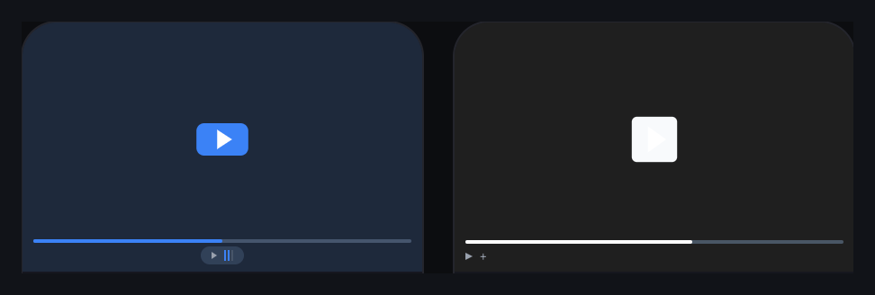
These previews are starting points for review, not an accessibility endorsement. In the monochrome example, the light play symbol against a light button deserves particular attention before use. Judge the actual rendered result rather than assuming a gallery preview has passed every usability check.
Player skins and play-button customization do not imply that you can independently change every control, add any visual asset or reproduce an arbitrary design. Keep the requested treatment within the options you have verified for your own setup.
Test the treatment against different visual conditions
Use the actual opening frame and page background when comparing candidates. If the player appears over changing footage during an interaction, review the relevant moments too. A design approved against an empty dark preview may behave visually quite differently beside detailed imagery.
These hypothetical examples show how a visual brief can guide the decision:
- A bright product demonstration on a white page: check whether a light player treatment leaves the play control difficult to identify. A stronger accent may be worth testing, but assess the symbol’s contrast as well as the surrounding button.
- A restrained professional-services page: a vivid treatment might compete with the explanation. Try a quieter skin while preserving a clear playback invitation.
- A colorful educational page: matching every accent may add noise. Choose one visual relationship to carry through, such as the main accent, and leave the rest uncomplicated.
None of these choices guarantees more plays or better business results. They are design hypotheses to inspect in context, not universal prescriptions for a particular audience or industry.
Review the real embed at smaller sizes
Place the candidate on its intended page before sign-off. Reduce the viewport and check the full player boundary, not just the central play button. The player should fit the content area without requiring horizontal scrolling or clipping important controls.
Check whether the play symbol remains easy to identify, nearby page elements collide with the player, or the caption and supporting explanation become separated from it. If the layout breaks, investigate the page and embed configuration rather than trying to disguise the problem with a different color.
Then review keyboard interaction, visible focus and enlarged-page viewing in the chosen implementation. Styling and functionality need separate checks. A static screenshot can show a visual treatment; it cannot prove that the live player is usable with different input methods.
Make the approved treatment easy to review again
Keep a short design record with the chosen skin, the intended play-button treatment, a reference page capture and any unresolved checks. Record what the team approved rather than relying on a description such as “the blue one.” This can be an ordinary project document; it does not require a player-specific approval feature.
Revisit that reference when the page background, brand palette or video’s opening changes. The same treatment may need another review in a different context. Do not assume that a previously acceptable combination remains equally clear everywhere.
For your next embedded video, choose one candidate treatment and review it beside the finished page at a wide and a narrow width. Keep the changes that help the player belong, and remove the ones that make playback harder to recognize.